The Fall of the House of Usher
Dec. 4, 2023

Michael Fimognari shoots 65 mm on Netflix’s “The Fall of the House of Usher”

Edgar Allen Poe’s classic tale is reimagined by DP/director Michael Fimognari and co-director Mike Flanagan using ARRI Rental’s ALEXA 65 camera with two contrasting lens series.

Dec. 4, 2023

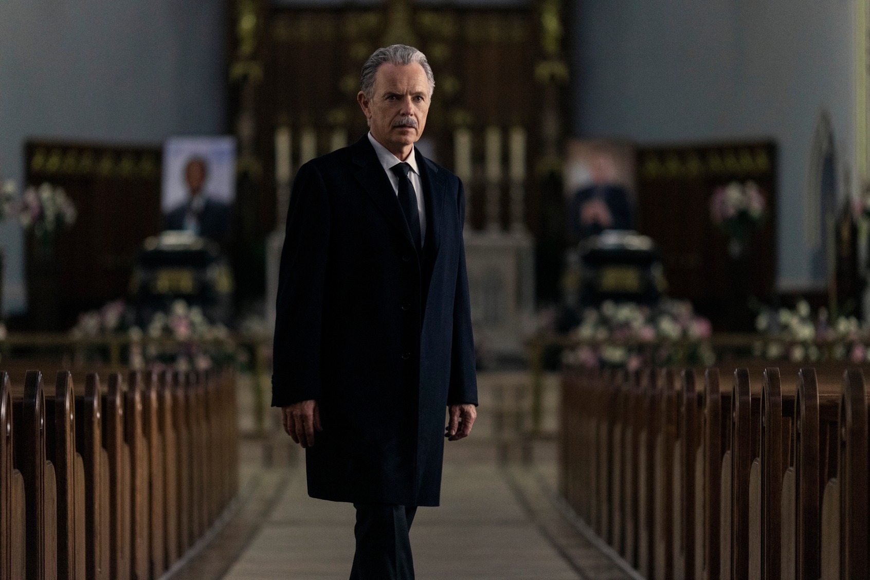
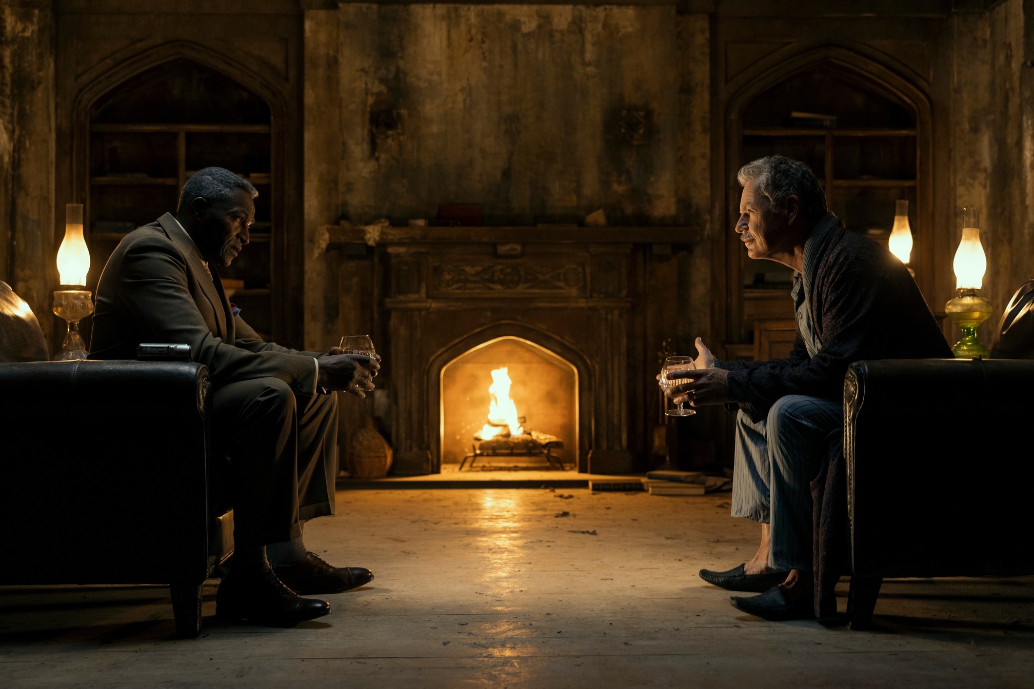
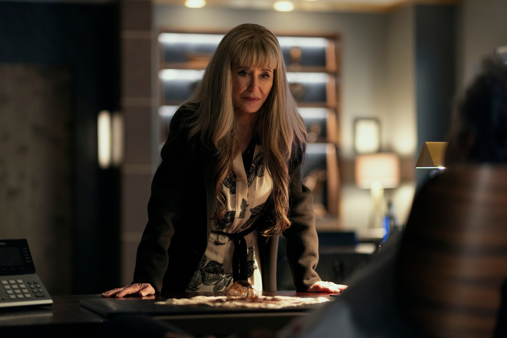
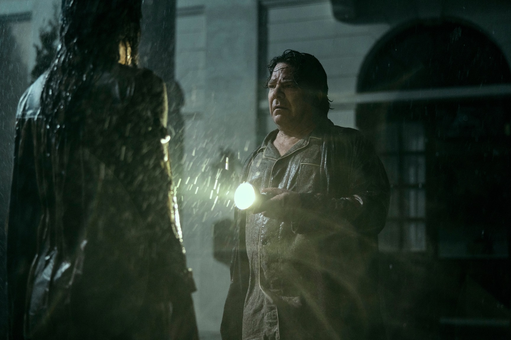
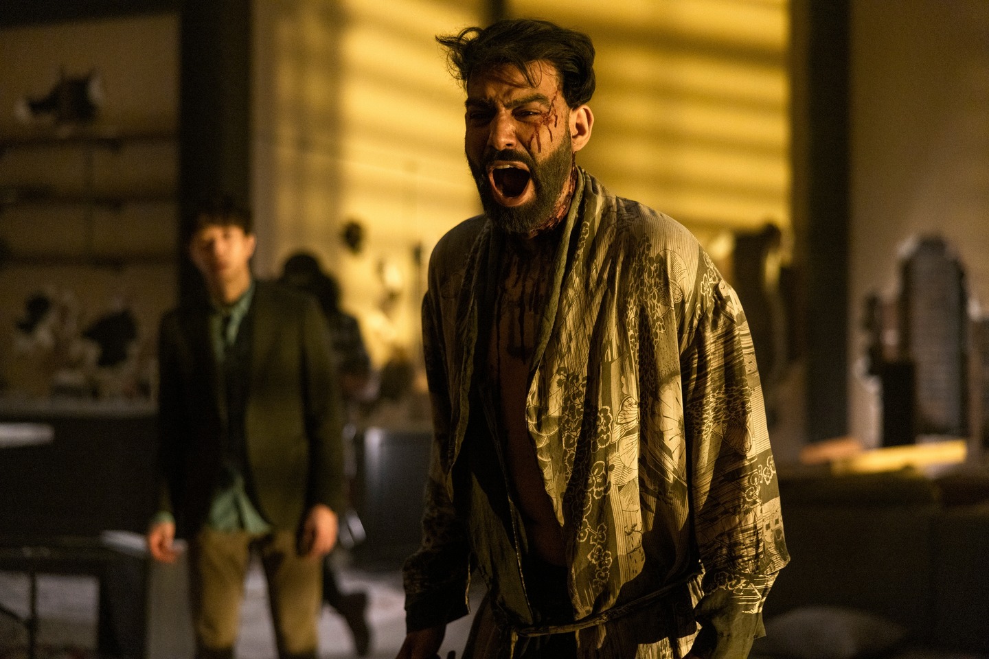
In crafting a look for “The Fall of the House of Usher,” director/cinematographer Michael Fimognari built a visual tapestry that draws on Edgar Allan Poe and the Italian giallo genre. Working with writer/director Mike Flanagan, Fimognari turned to the 65 mm format and ARRI Rental’s ALEXA 65 camera system. In this interview he explains his creative choices and why he selected two very different lens series – Prime DNA and Leitz Thalia – for the Netflix series about Roderick and Madeline Usher, two ruthless siblings who establish a powerful family dynasty only to witness it unravel with the mysterious deaths of their heirs.

Can you share insights into your collaboration with Mike Flanagan and how it shaped the visual storytelling in “The Fall of the House of Usher”?

“The Fall of The House of Usher” was a new twist on a long and fantastic collaboration. Over the past eleven years I’d shot series and features for Mike, and on “Usher” we split the directing work; he directed four episodes, and I directed the other four, and I served as cinematographer for all eight. As Mike does for everything he creates, he has a clear vision for how to present the themes and tone for the overall story. He defined it in his plan for this two episodes which gave me the structure as a director to build something consistent with his overall creative vision.

How did you capture the mood of Edgar Allan Poe in your cinematography?

Mike wanted to create something with a gothic feel in a contemporary setting. There’s brick and stone, contrasted with glass and steel. One of Mike’s first visual concepts was to showcase each of the Usher children’s deaths in vivid, pure hues inspired by Italian giallo cinema. This was inspired by the use of color in The Masque of the Red Death, and we used it in lighting, wardrobe, and design.

Why did you select 65 mm as the acquisition format for this show?

I love the working in 65 mm with the ALEXA 65 because the color separation is excellent on a discreet level, especially when you get into particular hues and secondary colors that you can craft and shape more specifically. I first worked with it on "Gerald's Game" where there's an eclipse sequence that Mike and I wanted to start as a typical day scene and then transform to an intense red over about two minutes. It's almost imperceptible at first but becomes a disruptive and upsetting red, overtaking the moment in the story, which was only achievable by having an incredible amount of color control. The difference between what the ALEXA 65 could do on that fine level and anything else we'd used before was stunning.

How many different cameras were you working with and how did you split the coverage between them?

We make detailed shotlists that also represent a blueprint for the edit. In our plans, every shot matters. There are no arbitrary frames; no “I hope we get it” shots, or “have a camera just grab stuff” shots. We're always looking for opportunities, but they become shots that we need to get if choose them.

When we’re building a crew, the first step for me is to assemble a team of storytellers who see the value of their shot as their expression, developed together with us. Once you have those people, you arm them with the tools they need to execute their shots, and every shot on the list is an important shot.

I have felt that, in the world of camera department hierarchy, the A, B, and C-camera designations can be a burden to the team if interpreted as deserving (or not) of a particular type of shot. We decided to go with a color breakdown of the cameras, so we have green, blue, and red cameras. This helps communicate that we’re all valued, we are all here to tell a story, and we’re all skilled enough to do it.

What was the creative rationale behind using two different lens series?

We always do lens tests for everything. It's great that we'll come into ARRI Rental and have the lenses all laid out, and we'll spend hours looking at how the bokeh appears, and the clarity and the sharpness, and how it distorts in good ways and what's appropriate for the story. So, every project is a new expression and a further exploration of optics. In "The Fall of the House of Usher" you've got two time periods, each representing a different emotional component for our characters. Roderick and Madeline grew up in what might have been a positive world with their mother, but it ends horribly for them. Later, when Roderick is starting a family, he has another chance to be an upstanding man, reflecting the ambiguous and amorphous qualities of the ARRI Rental DNA lenses. I see them as earthy and imperfect in a perfect way.

Then there's Roderick in a modern setting where he's now a monstrous pharmaceutical titan and his children take advantage of every opportunity to hurt the people around them. There's a two-dimensional perception that they have shut out those beautiful imperfections of the world because they've crafted this fortress that can't be influenced by the world outside. And they're willing to hurt that world outside. So, the rigidity of that, the steel and glass and facade of that made it feel appropriate to be more precise and sharper. It's more monstrous to have everything clean and linear and I thought that the Leitz Thalias, while beautiful, represented that.

How did you judge acceptable levels of darkness on set?

We’re always discussing ways to scare you in the shadows, and each story needs a different expression. Since our first film, “Oculus,” we’ve explored what it means to see in the dark, and horror movies, for as long as they’ve existed, have expressed darkness in different ways.

Expanding from the tone of the story we ask: How much do you need to see to understand the geography of a scene? And do you need to understand the geography to connect with the emotions, or is withholding that information the more powerful choice? What’s in the shadows, and how much is the terror related to the darkness? Each of our stories is a little different. During a storm scene in “Usher,” the scary things in the dark are only visible when lightning strikes otherwise, but there’s no information in the shadows – no amount of squinting will save you - which creates a jolt. Whereas in “Gerald’s Game” we massaged in the grade to ensure that you can see just enough in the shadows to understand the terrifying shapes in the corner, and it’s the squinting that created the necessary feeling of rising dread.

What was your process for storyboarding?

Whether we're going to shoot on location or in a space that hasn't been built yet, Mike always has a picture in his mind of what he wants it to be and he'll define the behavior of the actors in that space and where he wants the camera. That then becomes a shot list and an overhead plan, which I'll build out so that it's ready to distribute to people. It allows us to get the equipment ordered and make sure that the art department and construction department do their work according to the lighting and design needs, and then it comes back to us for another filtration process. In the end we have a bible -- a descriptive shot list, as well as an overhead plan, that is blocking and camera combined.

It's an exact and exhaustive process that goes back to Mike's first ideas of what the scene is, what the actors will do, and how we will use it in the edit. I now do the same for my work as a director. We share all that data with the crew, so it ends up being a straightforward answer for anyone who says, "How are we going to do this?" Our crew shows up knowing how the scene is going to go. There is no mystery and the sets are built to accommodate our plan.